Youth
Curious, social individuals
who enjoy discovering new spaces and aesthetically pleasing
environments.
GELATO MAESTRO
GELATO MAESTRO

the brief
the brief
the brief
A new gelato shop on Southern Avenue needed an identity that could hold two things at once: the warmth of a familiar neighbourhood spot, and the refinement and quality of a premium product.
A new gelato shop on Southern Avenue needed an identity that could hold two things at once: the warmth of a familiar neighbourhood spot, and the refinement and quality of a premium product.
CLIENT
CLIENT
Gelato Maestro,
Gelato shop in Southern Avenue, Kolkata
@gelatomaestroindia
Gelato Maestro,
Gelato shop in Southern Avenue, Kolkata
@gelatomaestroindia
YEAR
YEAR
2026
2026
INDUSTRY
INDUSTRY
Gelato (food industry)
Gelato (food industry)
Creative vision
Creative vision
The client envisioned the cafe around the following keywords :
Comforting
One-of-a-kind
Authentic
Illustration-driven
Semi-premium
The client wanted a deliverable that focused around the following keywords :
Luxurious
Premium
Trust
Stress-relief
Self Care
deliverables
deliverables
Brand Identity, Packaging, Uniform Design, Social Media
Brand Identity, Packaging, Uniform Design, Social Media
COMPETITOR ANALYSIS
COMPETITOR ANALYSIS
COMPETITOR ANALYSIS
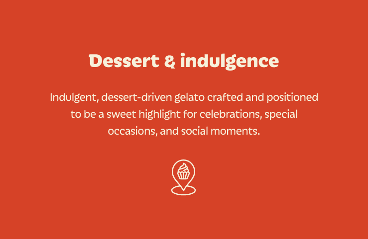
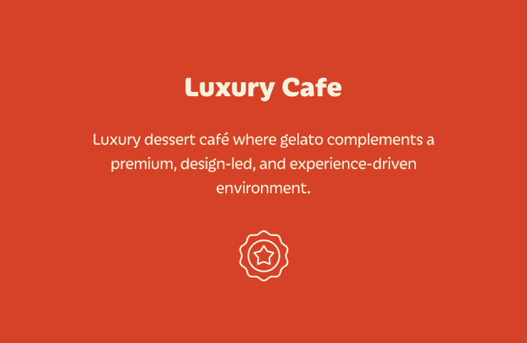
After extensive research into gelato brands in India, four common directions emerged in the way gelato cafés typically position themselves. I divided the analysis into gelato brands and ice cream brands that are relevant. Few amongst Gelato were Gelato Vinto, Italiano Gelato, etc and few amongst ice cream brands are Milano Icecream, Baskin Robbins and more.
After extensive research into gelato brands in India, four common directions emerged in the way gelato cafés typically position themselves. I divided the analysis into gelato brands and ice cream brands that are relevant. Few amongst Gelato were Gelato Vinto, Italiano Gelato, etc and few amongst ice cream brands are Milano Icecream, Baskin Robbins and more.
After extensive research into gelato brands in India, four common directions emerged in the way gelato cafés typically position themselves. I divided the analysis into gelato brands and ice cream brands that are relevant. Few amongst Gelato were Gelato Vinto, Italiano Gelato, etc and few amongst ice cream brands are Milano Icecream, Baskin Robbins and more.


Target audience
Target audience
Target audience
The target audience was defined by the client themselves : a clear picture of the crowd they wanted to attract. It aligned closely with how the café was already set up : power sockets for working professionals settling in for a few hours, a dedicated smoking area, and a layout built for people who'd come to linger.
The target audience was defined by the client themselves : a clear picture of the crowd they wanted to attract. It aligned closely with how the café was already set up : power sockets for working professionals settling in for a few hours, a dedicated smoking area, and a layout built for people who'd come to linger.
The target audience was defined by the client themselves : a clear picture of the crowd they wanted to attract. It aligned closely with how the café was already set up : power sockets for working professionals settling in for a few hours, a dedicated smoking area, and a layout built for people who'd come to linger.


BRAND ROUTES
BRAND ROUTES
BRAND ROUTES
The next step was to figure out possible directions for the brand, for which I mapped two distinct ones : one leaning premium, the other playful. Each was presented as a 3×3 grid, a compact visual preview of how the brand could come to life.
The next step was to figure out possible directions for the brand, for which I mapped two distinct ones : one leaning premium, the other playful. Each was presented as a 3×3 grid, a compact visual preview of how the brand could come to life.
The next step was to figure out possible directions for the brand, for which I mapped two distinct ones : one leaning premium, the other playful. Each was presented as a 3×3 grid, a compact visual preview of how the brand could come to life.
route 1
route 1
route 1







The first route was premium and product-led. I built the grid around moody, high-contrast photography and quiet, considered moments, showing the client how the brand could live across a full experience.
The first route was premium and product-led. I built the grid around moody, high-contrast photography and quiet, considered moments, showing the client how the brand could live across a full experience.
The first route was premium and product-led. I built the grid around moody, high-contrast photography and quiet, considered moments, showing the client how the brand could live across a full experience.
route 2
route 2
route 2


The second route was a deliberate counterpoint: illustration-led, lifestyle-driven, and built around the people who would actually be in the shop. A brand positioned in the everyday life.
The second route was a deliberate counterpoint: illustration-led, lifestyle-driven, and built around the people who would actually be in the shop. A brand positioned in the everyday life.
The second route was a deliberate counterpoint: illustration-led, lifestyle-driven, and built around the people who would actually be in the shop. A brand positioned in the everyday life.
After reviewing both routes, the client's initial instinct leaned towards premium, but a stronger pull toward something different kept surfacing. A quick competitor scan confirmed it: most gelato brands in India were already playing in the premium space, leaving the playful direction largely untapped. That settled it. We moved forward with the illustrative route, but with a clear brief to themselves: keep it structured, keep it considered, and let the fun sit inside a premium frame.
After reviewing both routes, the client's initial instinct leaned towards premium, but a stronger pull toward something different kept surfacing. A quick competitor scan confirmed it: most gelato brands in India were already playing in the premium space, leaving the playful direction largely untapped. That settled it. We moved forward with the illustrative route, but with a clear brief to themselves: keep it structured, keep it considered, and let the fun sit inside a premium frame.
Tone of voice
Tone of voice
Tone of voice
With the MVP set in stone, I translated my understanding of the client and their audience into a clear tone-of-voice framework, placing the brand deliberately along each spectrum to capture how it should sound, not just look. The client loved the tone of voice and said it reflected their exact vision for the cafe.
With the MVP set in stone, I translated my understanding of the client and their audience into a clear tone-of-voice framework, placing the brand deliberately along each spectrum to capture how it should sound, not just look. The client loved the tone of voice and said it reflected their exact vision for the cafe.
With the MVP set in stone, I translated my understanding of the client and their audience into a clear tone-of-voice framework, placing the brand deliberately along each spectrum to capture how it should sound, not just look. The client loved the tone of voice and said it reflected their exact vision for the cafe.
brand house
brand house
brand house
With the client's perception of the brand, the target audience, and the agreed creative route all aligned, I pulled together a complete picture of what Gelato Maestro could look like as a whole. The client approved it in one go. From there, I built out the brand house : a single view of everything Gelato Maestro is, and everything it stands for.
With the client's perception of the brand, the target audience, and the agreed creative route all aligned, I pulled together a complete picture of what Gelato Maestro could look like as a whole. The client approved it in one go. From there, I built out the brand house : a single view of everything Gelato Maestro is, and everything it stands for.
With the client's perception of the brand, the target audience, and the agreed creative route all aligned, I pulled together a complete picture of what Gelato Maestro could look like as a whole. The client approved it in one go. From there, I built out the brand house : a single view of everything Gelato Maestro is, and everything it stands for.
.
" height="114.88265306122503px" id="GISLAWRgA" width="848px"/></svg>)
Gelato Maestro
Gelato Maestro
Gelato Maestro
Our Beliefs
Our Beliefs
We believe in creating gelato and coffee experiences so thoughtfully made, that ease feels instinctive.
We believe in creating gelato and coffee experiences so thoughtfully made, that ease feels instinctive.
We believe in creating gelato and coffee experiences so thoughtfully made, that ease feels instinctive.
Our Promise
Our Promise
To provide people with an experience that feels new but still familiar. A safe space to collect your thoughts.
To provide people with an experience that feels new but still familiar. A safe space to collect your thoughts.
To provide people with an experience that feels new but still familiar. A safe space to collect your thoughts.
Rational Benefits
Rational Benefits
Precision led craftsmanship
Precision led craftsmanship
Precision led craftsmanship
Thoughtful service
and experience
Thoughtful service
and experience
Thoughtful service
and experience
Refined gelato
and premium
coffee offerings
Refined gelato
and premium
coffee offerings
Refined gelato
and premium
coffee offerings
Authentically
modern experience
Authentically
modern experience
Authentically
modern experience
Emotional Benefits
Emotional Benefits
A calming
daily pause
A calming
daily pause
A calming
daily pause
Familiarity with
quiet delight
Familiarity with
quiet delight
Familiarity with
quiet delight
Reassurance without overthinking
Reassurance without overthinking
Reassurance without overthinking
Our Values
Our Values
Craftsmanship
Craftsmanship
Craftsmanship
Authenticity
Authenticity
Authenticity
Playfulness
Playfulness
Playfulness
Courtesy
Courtesy
Courtesy
LOGO
LOGO
LOGO
The logo was the result of several long working sessions with the client, refining a direction that had to balance a few competing demands : non-illustrative and structured, premium but friendly. We explored a range of options together before landing on this one.
The logo was the result of several long working sessions with the client, refining a direction that had to balance a few competing demands : non-illustrative and structured, premium but friendly. We explored a range of options together before landing on this one.
The logo was the result of several long working sessions with the client, refining a direction that had to balance a few competing demands : non-illustrative and structured, premium but friendly. We explored a range of options together before landing on this one.

STRUCTURED
STRUCTURED
STRUCTURED
PLAYFUL
PLAYFUL
PLAYFUL
TRUSTWORTHY
TRUSTWORTHY
TRUSTWORTHY
VERSATILE
VERSATILE
VERSATILE
I opened with a spread of directions, both mascot-led and type-led. The client ruled out a mascot early and connected with the sketch behind the final mark, which I refined into balance. They responded to the human details : the t forming a quiet smile, the r settling the wordmark. For the logomark, we tested a range of containers before the rounded form won out. The mark itself was my proposal, drawn from the t and o to read as a scoop of gelato in a cup, chosen by the client over a simpler monogram M.
I opened with a spread of directions, both mascot-led and type-led. The client ruled out a mascot early and connected with the sketch behind the final mark, which I refined into balance. They responded to the human details : the t forming a quiet smile, the r settling the wordmark. For the logomark, we tested a range of containers before the rounded form won out. The mark itself was my proposal, drawn from the t and o to read as a scoop of gelato in a cup, chosen by the client over a simpler monogram M.
suite
suite
suite


The height of strapline Z is 1/3rd of the logo’s capheight C.
The height of strapline Z is 1/3rd of the logo’s capheight C.
The height of strapline Z is 1/3rd of the logo’s capheight C.

The height of strapline y is 1/2 of the logo’s capheight C.
The height of strapline y is 1/2 of the logo’s capheight C.
The height of strapline y is 1/2 of the logo’s capheight C.

colour palette
colour palette

Maestro Orange
RGB : 214 66 39
CMYK : 10 89 100 2
HEX : #d64227
Sweet Cream
RGB : 247 241 219
CMYK : 3 3 14 0
HEX : #f7f1db

Milky Blue
RGB : 189 225 247
CMYK : 24 2 0 0
HEX : #bde1f7

Cocoa Brown
RGB : 66 29 25
CMYK : 46 79 74 68
HEX : #421d19
tricolour applications
tricolour applications
tricolour applications


brand illustrations
brand illustrations
brand illustrations


There was no detailed brief for the illustrations, just that they needed to feel like the brand. What guided me instead was a word the client returned to in nearly every meeting: generous. They spoke often about their portions, how they'd always give two scoops where someone else might give one. It seemed too good an idea to leave in conversation. So I let it shape the entire illustration language : drawing the gelato and coffee oversized, almost overwhelming the figures holding them, so that generosity wasn't just stated but felt.
There was no detailed brief for the illustrations, just that they needed to feel like the brand. What guided me instead was a word the client returned to in nearly every meeting: generous. They spoke often about their portions, how they'd always give two scoops where someone else might give one. It seemed too good an idea to leave in conversation. So I let it shape the entire illustration language : drawing the gelato and coffee oversized, almost overwhelming the figures holding them, so that generosity wasn't just stated but felt.


typography
typography
typography
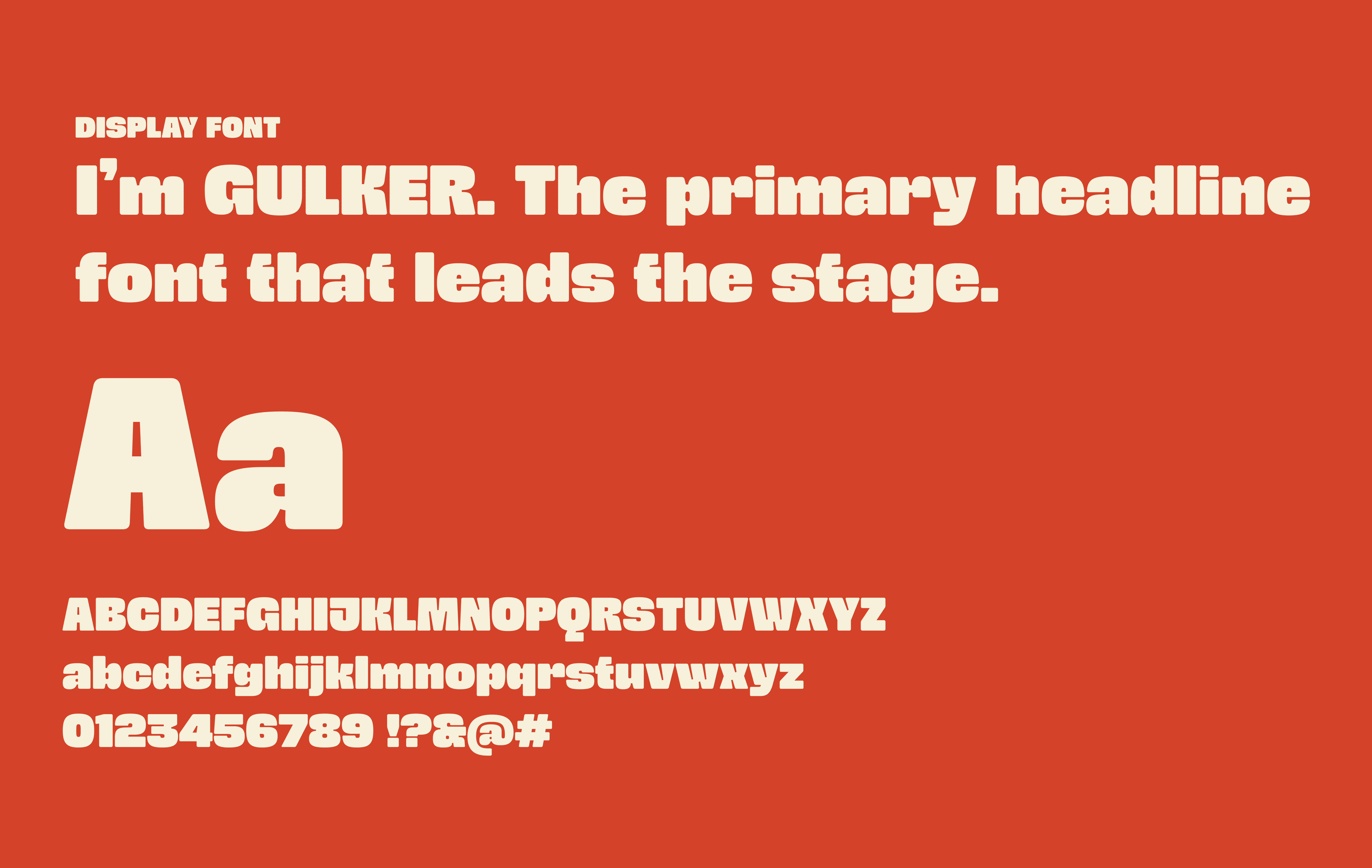
Typography was one of the core focuses of the system. The display face needed to do something tricky, feel quirky and fun, yet stay structured. Gulker nailed it: characterful enough to carry the brand's playful side, disciplined enough to keep it premium.
For the secondary face, I wanted something soft to balance it, and Iskra fit perfectly : its smooth, rounded curves echo the swirls of gelato itself, giving the pairing a quiet thread back to the product.
Typography was one of the core focuses of the system. The display face needed to do something tricky, feel quirky and fun, yet stay structured. Gulker nailed it: characterful enough to carry the brand's playful side, disciplined enough to keep it premium.
For the secondary face, I wanted something soft to balance it, and Iskra fit perfectly : its smooth, rounded curves echo the swirls of gelato itself, giving the pairing a quiet thread back to the product.

social media
social media
social media
For the launch month, I came on as co-social media manager and the role spanned everything. Strategy, copywriting, feed planning, and the coordination that rarely makes it into the final post: briefing and scheduling photographers, working through angles and timings, and keeping the client aligned throughout. It was a demanding stretch. And in keeping with the brand, we built an illustration-led feed : a direction still rarely seen across Indian gelato handles.
For the launch month, I came on as co-social media manager and the role spanned everything. Strategy, copywriting, feed planning, and the coordination that rarely makes it into the final post: briefing and scheduling photographers, working through angles and timings, and keeping the client aligned throughout. It was a demanding stretch. And in keeping with the brand, we built an illustration-led feed : a direction still rarely seen across Indian gelato handles.





LEARNINGS
LEARNINGS
LEARNINGS
This was one of the first full-fledged client brand projects I'd taken on end to end : a genuine test of translating a client's vision into a complete brand experience in under a month.
The countless hour-long meetings turned out to be the most valuable part, teaching me how to listen for what a client actually wants rather than just what they say.
I learnt to balance that vision against what an audience in Kolkata would genuinely respond to : grounding the brand in real, local context.
Most of all, I came away understanding how to shape and steward an entire brand experience, and how to give it a voice built to last.
This was one of the first full-fledged client brand projects I'd taken on end to end : a genuine test of translating a client's vision into a complete brand experience in under a month.
The countless hour-long meetings turned out to be the most valuable part, teaching me how to listen for what a client actually wants rather than just what they say.
I learnt to balance that vision against what an audience in Kolkata would genuinely respond to : grounding the brand in real, local context.
Most of all, I came away understanding how to shape and steward an entire brand experience, and how to give it a voice built to last.
This was one of the first full-fledged client brand projects I'd taken on end to end : a genuine test of translating a client's vision into a complete brand experience in under a month.
The countless hour-long meetings turned out to be the most valuable part, teaching me how to listen for what a client actually wants rather than just what they say.
I learnt to balance that vision against what an audience in Kolkata would genuinely respond to : grounding the brand in real, local context.
Most of all, I came away understanding how to shape and steward an entire brand experience, and how to give it a voice built to last.
VIEW OTHER PROJECTS
VIEW OTHER PROJECTS
VIEW OTHER PROJECTS
Have big ideas
in mind?